
In a previous article, we’ve already touched briefly upon what a RIP is. Today, we’d like to delve a little deeper into the technicalities of Roland’s most widely used RIP software to date: VersaWorks 6.
A brief history of VersaWorks
In 2004, Roland DG launched the first edition of its VersaWorks RIP software, alongside the legendary VersaCAMM SP Series. Like any other RIP software, its primary function was to translate RGB and CMYK continuous tone design files (like vector and bitmap files) into raster image files, or multi-layered bitmap files, which are needed for printing.
VersaWorks was designed to be an intuitive, easy-to-use graphical interface, with a truly unique value proposition. For the first time, users would be able to benefit from a dedicated RIP that was directly included in their purchase and built specifically for their machines. And, unlike most 3rd party RIPs at the time, it didn’t force them to pay for features they would never actually use. In this sense, VersaWorks was pretty revolutionary.
The current version of VersaWorks, VersaWorks 6, is driven by Global Graphics’ Harlequin processor and screening engine. Global Graphics has a proven track record in traditional printing industries like commercial offset or flexographic printing, where it is known for ripping and separating files with high precision and speed, for exceptional colour reproduction.
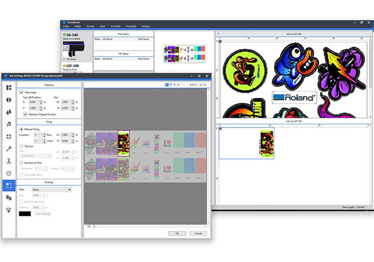
Today, VersaWorks 6 is the primary RIP for most of our printing devices, with a solid reputation of usability, performance, and free lifetime updates. And thanks to its powerful engine, it does a lot more than merely ‘translating’, upscaling or resizing print files, offering a wide range of additional features such as job calculation, variable data printing, advanced colour matching, and much more.
But let’s start at the beginning, because to understand just how much this software can do, you need a good grasp of the basics. In this blog, you will discover how the raster image process (or RIP) actually works, what screening rules do, and what to pay attention to when upscaling images.
Converting images into something printable
To make design files printable, they first need to be “rasterized” so that the output device is able to accurately reproduce the data. How is this done? By converting these continuous-tone files into digital halftone files. A digital halftone file consists of multiple layers.
These layers are basically bitmap files. They each consist of a matrix filled with (in this case single-coloured) dots of various shapes and sizes. How these dots appear on these matrixes, and how these matrixes relate to each other, defines how your printing device will reproduce all the colours, shades and tonal variations that appear on your image.
Rasterizing, then, is really about the RIP translating continuous-tone CMYK or RGB files (the ones most commonly used for digitally produced content) into multiple bitmap files, separated by process (and occasionally spot) colours.
During this raster image process, a screening rule will be applied in combination with a pre-defined dot density and shape. These rules will determine how many dots of various sizes will be placed on each individual square of the matrix. This will not only determine the exact shades of each colour, but will also eliminate any distracting effects on the printed output that could result from producing these file separations, such as moiré patterns or dot gain.
Deep dive into RIP screening rules
To understand how screening rules work, let’s go back to our halftone dots for a minute. We may be tempted to think of these dots as round circles, but that isn’t always the case. In fact, the most commonly used dot shapes when printing, besides round, are square and elliptical. This is important to remember, because both the dot shape and how our dots are structured on the matrix have a significant impact on possible artefacts and tonal gradients.
And this is where screening rules come in. In general, there are three main analogue types of screening rules that are used to place dots, namely, Amplitude Modulation (AM), Frequency Modulation (FM) also known as Stochastic Screening, and Hybrid Screening.
With AM, tonal gradation ranges from 0 % to 100 %, starting with small radius dots (0%), and ending with big radius dots (100 %). These dots are placed on an orthogonal grid. The larger the dot size, the darker the tonal value. In the case of black ink, if the dot fills 0% of the square, the printer reads is as white. If it fills 100%, it reads it as black. And all the shades of grey sit somewhere in between.

With FM, tonal gradation also ranges from 0 % to 100 %, but the dot size remains consistent, and the dots are placed stochastically (or randomly). Instead of the density tone being defined by an increasing dot size, it’s defined by the amount of same-sized dots per area. Areas with a high amount of dots are darker, areas with fewer dots lighter. Because of the overall higher dot frequency, this method allows for much finer details.

Hybrid screening, lastly, uses a combination of AM and FM. In hybrid screening, lighter areas with fewer colour differences may rely on amplitude modulation, while more complicated, coloured or darker areas may use frequency modulation.
In digital printing, we mostly use frequency modulation and hybrid screening techniques in combination with advanced algorithms to achieve the desired effect. And this brings us to the screening methods that can be selected in VersaWorks 6: "Dither" and "Error Diffusion".
Which screening method should I select in VersaWorks 6?
Now that we understand what screening rules are, it’s easy to explain the difference between “Dither” and “Error Diffusion”. They are both hybrid halftone patterning techniques that allow for an extended range of tones and colours.
With “Dither”, the RIP will use a specific dithering pattern to yield faster processing results. “Error Diffusion”, on the other hand, will also take into account the surrounding pixels, leading to superior results and much finer details, but also longer processing times.
Therefore, we suggest to only use Error Diffusion for more complicated images with lots of tonal variations and details, such as photographs, and Dither Pattern for outputs with fewer colours and tonal differences, such as floor graphics and other similar signage material. Be aware that by default, VersaWorks 6 will use the Dither Pattern screening rule.
So, what about upscaling?
Knowing what a halftone file looks like and how screening rules work, it’s not hard to understand why upscaling images can be such a complicated, error-prone process. After all, the RIP already needs to perform a host of calculations to separate your files and determine where to place each pixel.
Whenever you want to upscale a bitmap image file, you’re asking your RIP to not just create separate colour files and arrange pixels on the grid with varying degrees of complexity, but to also calculate this for areas that don’t exist in the original file. Because, as most of you are probably well aware of, banners are not created in a 6 metres by 6 meters format; instead, the design file is usually 60 cm by 60 cm. And it’s up to the RIP to scale up the design to the excepted output size through interpolation.
But interpolation has its limits. We can’t just expect our RIP to scale up lower resolution images to high definition outputs, because the lower the base resolution, the faster the dots will become visible to the human eye. So, it’s always important to prepare your files well and choose the right resolution, especially if you want to achieve photorealistic results. Then, in the final step, you can let VersaWorks upscale the image further to the desired ratio.
To do this, you can select one of the following three interpolation algorithms in VersaWorks:
- Nearest Neighbor: VersaWorks will upscale your designs by using the information of the nearest pixel in the output. It's very fast and simple, but also the least accurate.
- Bi-Linear: VersaWorks will upscale your design by using the weighted average of the colour values of 2 x2 linear pixels. It's a bit less fast but yields excellent tonal results.
- BiCubic: VersaWorks will upscale the design by considering the colour values of 8 linear pixels to create 1 new pixel. BiCubic interpolation generally gives the best results for gradients and photographs, but it results in the longest RIP process.
Get printing
Now that you understand what actually goes inside your printer during the image raster process, how screening rules work, and what our basic algorithms can do to improve image quality and upscale your pictures, you should be able to give a better estimate of how long certain jobs will take and what file sizes your customers need to supply to achieve the desired output results.
But of course, practice makes perfect. That’s why we always encourage our customers to experiment. You could, for example, try printing the same image using various settings and techniques. Plus, our team is always ready to help.
In our next blog, we’ll take a look at linearization, ICC profiles and colour matching. Don’t want to miss it? Bookmark this page or subscribe to our newsletter.
Find out more about
VersaWorks 6 RIP software
